Electric Island is a powerful immersive experience – an adult playground in a unique natural location. Over a series of 5 events spanning the course of the summer in Toronto, it showcases musical talent at its finest.
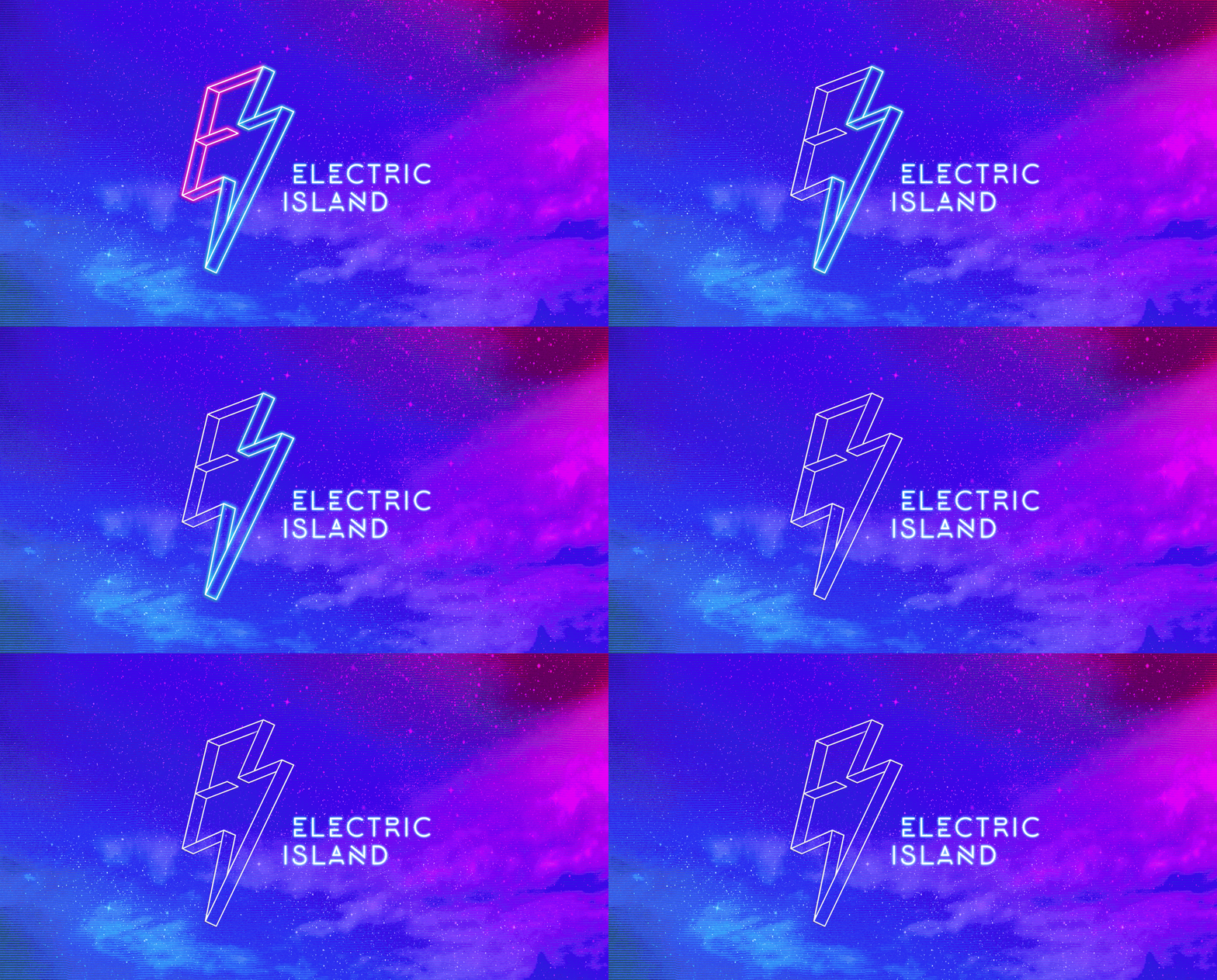
Drawing inspiration from their previous logo of the bolt of energy, the redesign of the mark is more abstract. Adding the illusion of depth, the new logo has a 3D effect of glowing neon lights that references the underground music vibe of the festival while integrating an "E" and "I" into the lightning bold shape.
As the unique outdoor location of Electric Island is what sets it apart from other music festivals, I combined the raw power of the elements of nature — air, fire, water, space, earth — with a dynamic gradient colour palette to thematically brand each of the 5 individual weekend events that span the summer season that make up the full festival.
The elements can manifest in various forms for differentiation from year to year. Water for example can be represented by droplets one year, waves the next and bubbles the following.
Most people don’t know that Electric Island is comprised of 5 separate events spanning the summer. The aim of the standalone poster was to convey that to viewers. It features the main festival art while teasing the a sliver of the creative for each hero poster for the individual events branded with an element — water, air, earth, fire, space — and gradient colour palette.
The Hero Posters serve to generate excitement for the featured headlining artists for specific events.
Role: Creative Direction, Design
Client: Electric Island, Embrace Entertainment
Scope: Logo Rebrand, Event Branding


